
Top 10 Mistakes Small Business Owners Make When Designing Their Own Website (And How to Fix Them)
Designing your own website as a small business owner can feel empowering - and budget-friendly. Thanks to DIY website builders and drag-and-drop tools, you don’t need to be a coder to launch a professional site.
But while DIY website design is doable, it’s also easy to make mistakes that cost you visitors, leads, and even sales.
The good news? Most of these mistakes are simple to fix once you know what to look out for.
In this post, we’ll walk through the 10 (ok, I’ve given you 11) most common DIY website design mistakes small business owners make—and show you exactly how to avoid them.
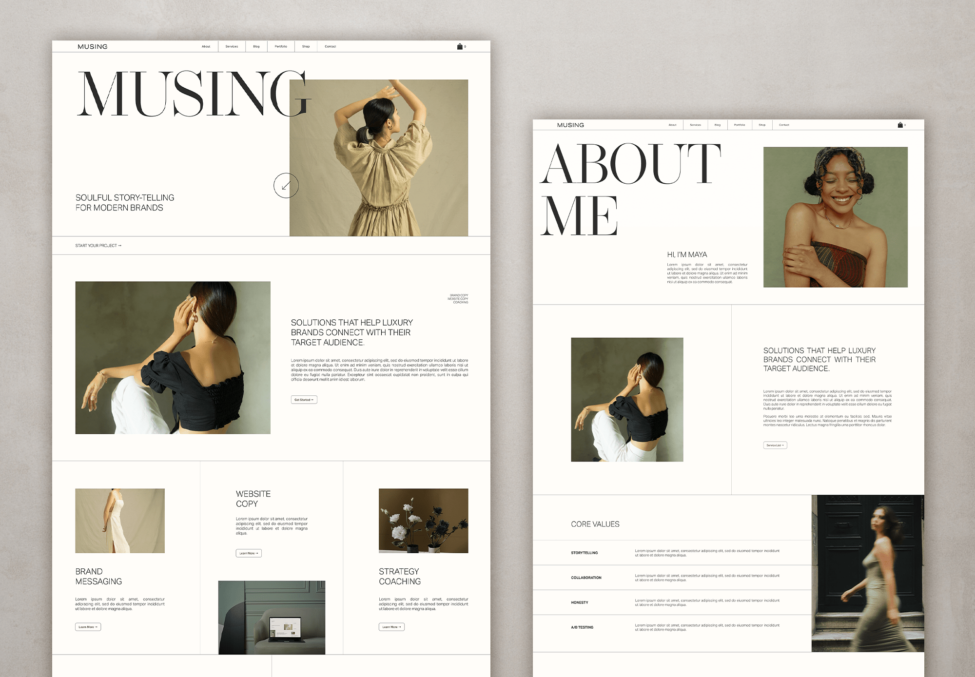
MUSING Squarespace template available in the shop
1. Overcrowded Homepages
Many first-time site creators try to cram everything onto the homepage—paragraphs of text, multiple images, and endless buttons. This overwhelms visitors instead of guiding them.
The fix: Keep your homepage clean and focused. Highlight your business’s main value proposition in one headline and use a single clear call-to-action (CTA), like “Book a Consultation” or “Shop Now.”
Remember: less is more when it comes to conversions.
2. Ignoring Mobile Optimization
Over 60% of web traffic comes from smartphones, yet many DIY sites don’t display properly on smaller screens. Text overlaps, buttons are too small, or images don’t resize.
The fix: Choose a responsive website template and preview your site on different devices before publishing. Make sure buttons are thumb-friendly and that your text remains legible on small screens.

ALTHEA theme in the shop
3. Slow Loading Speed
Large image files, unnecessary plugins, and clunky themes often slow DIY websites down. A slow site frustrates visitors and hurts search rankings.
The fix: Compress images before uploading, limit plugins, and consider using a caching tool. A good rule of thumb: your site should load in under three seconds.
4. Poor Font and Color Choices
Neon fonts, too many colors, or tiny text can make your website look unprofessional and hard to read.
The fix: Stick to two to three brand colors and choose clean, web-safe fonts like Arial, Open Sans, or Roboto. Ensure strong contrast between text and background for readability.

SHELLEY Squarespace theme available in the shop
5. No Clear Call-to-Action (CTA)
Many DIY websites simply provide information without telling visitors what to do next. This leaves potential customers unsure of their next step.
The fix: Place a clear CTA on every page. Examples include “Schedule a Free Quote,” “Sign Up for Our Newsletter,” or “Add to Cart.” CTAs should be short, action-oriented, and easy to find.
6. Weak Navigation
When menus are cluttered with too many links, visitors get lost and leave.
The fix: Keep navigation simple with 5–6 main menu items. Group secondary content under dropdowns if needed. Your menu should act like a roadmap, not a maze.
7. Stock Photos Overload
While stock photos are convenient, overusing generic images makes your business feel less authentic.
Customers may have seen the same image on multiple sites.
The fix: Use custom photos whenever possible—even high-quality smartphone shots of your team, office, or products work well. If you do use stock images, choose unique ones that reflect your brand personality.
8. Ignoring SEO Basics & writing like a person
DIY websites often miss simple SEO steps, like adding meta titles, descriptions, and alt text for images. This makes it harder for search engines to understand and rank your site.
The fix: Research keywords your customers search for and sprinkle them naturally into your content. Write like a person still though. Use correct headers, like only one H1 header per page and always write descriptive alt text for images.
All the Squarespace and Showit templates in my shop all come with basic SEO baked in - check them out to learn more about them and all the great things they cover for you.
9. Lack of Contact Information
Some small business sites forget to make contact details easily accessible. If visitors can’t reach you, they may move on to a competitor.
The fix: Display your phone number (if it suits your business, I don’t!), email, and location in the header, footer, or on a dedicated Contact page. Include a form and links to your social media profiles.
PRO TIP: If showing your phone number and email doesn’t suit your business, a contact form will do just fine. I often recommend having one in your footer so every page has a way to get in touch easily.
10. Forgetting About Security
Many DIY sites skip basic security steps like adding an SSL certificate. A “Not Secure” warning in the
browser scares off visitors and hurts trust.
The fix: Always use HTTPS (your web host usually provides a free SSL). Keep your site
updated—especially plugins and themes—and consider a basic security plugin to prevent hacks.
BONUS 11th Mistake - Not following best web design layout practices
This is actually a HUGE one as it will kill your conversion and hence, well, your sales.
A strategically planned out site will act as a 24/7 sales person for you - as it should be - and increase your enquiries. Why? Because an easy to navigate site, that is also strategically put together, makes it real easy for potential clients to click those CTAs.
Luckily, all my fave website templates are structured with this in mind so you don’t have to worry :)

PAPER PLACE Showit theme available in the shop
Building your own website as a small business owner doesn’t have to be complicated, but avoiding these mistakes will make your site more professional, user-friendly, and effective at converting visitors into customers.
Take a few minutes to review your current site against this list. Fixing even one or two issues can make a big difference in how potential customers view your business.
👉 Pro Tip: Create a simple checklist of these points and revisit your site every few months to make sure it stays updated, secure, and optimized.
And if you’re ready to take the next step, you don’t have to start from scratch. Check out some of my favorite website templates below - they’re affordable, modern, and beginner-friendly.
Plus, if the idea of designing it all yourself feels overwhelming, the good news is that most of these template providers also offer template styling services at a fraction of the cost of a fully custom site. It’s the perfect middle ground between DIY and professional design.
Check out some of my favourite Website Templates below
Special discounts kindly provided by the providers. Between 10-15% off for you!
All links are affiliate links which helps me to keep creating content at no extra cost to you.

Hey, I’m Stine
I’m a photographer, designer and (scrappy) content creator creating resources to help creatives and small business owners build the business of your dreams and a life on your own terms.
Thanks for stopping by! Sx