
Design a DIY Website That Converts - not one that just looks pretty
So, you've got a website. But does it actually work for your business?
Many small business owners pour time and energy into their websites, only to find that visitors aren't converting into leads or sales. The culprit? A website that looks good but doesn't guide visitors toward taking action..and that is the real issue.
But fear not: you don't need a fancy design degree or a big budget to fix this. With a few strategic tweaks, you can turn your website into a conversion machine. And yes, you can totally do this yourself!
In this post, we'll walk through simple, actionable DIY website design tips that will help you increase leads and sales.
We're talking clear CTAs, intuitive layout, mobile optimization, and more. Ready to make your website work harder for you? Let's dive in.
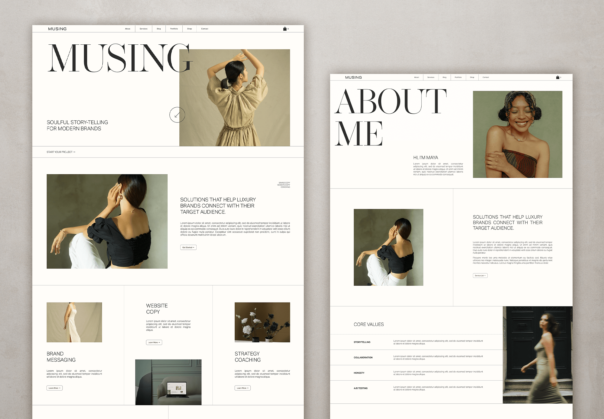
MUSING Squarespace template available in the shop
1. Understand What Conversion Means for Your Business
Before we get into the nitty-gritty of design, let's define what "conversion" means for you. Is it someone signing up for your newsletter? Booking a consultation? Making a purchase? Knowing your primary conversion goal is the first step in designing a website that delivers.
Once you've identified your goal, everything on your site should support it.
From your homepage to your contact page, each element should guide visitors toward taking that desired action.
‘Do right now’ Tip: Create a simple conversion map. List all the key actions you want visitors to take, and ensure every page on your website supports at least one of these actions. And voila! Watch the action being taken like never before.
2. Keep Your Layout Simple and Intuitive
Cluttered pages and confusing navigation are conversion killers. Visitors should be able to find what they're looking for without frustration. A clean, intuitive layout makes it easy for them to take the next step.
It makes me feel a bit like a broken record at times but it’s such an overlooked element that is too often overlooked.
Thankfully, there is a smorgasboard available of strategic and beautiful website templates these days so you no longer have to guess your way forward.
Study how the pros do it or, even easier, grab one to get your site off on the right foot.
ProTip: Sketch your homepage layout on paper before building it. Make sure there's a clear visual hierarchy with the main CTA as the focal point.

ALTHEA theme in the shop
3. Craft Clear and Compelling Calls-to-Action (CTAs)
Your CTAs are the gateway to conversions. If visitors can't easily figure out what action to take next, your website will struggle to generate leads or sales.
CTAs need to relate to the step in the customer journey - that means, if your customer is landing on your home page, something like ‘learn more’ or go explore’ are great as they are soft CTAs gently nudging them along in the journey. Remember, they have only just found you or your services, they might need to get to know you a bit more.
If they have already met you somewhere else and are landing on your sales page, a ‘buy now’ CTA is more appropriate. This CTA is hard and direct. And if you’ve done your copy and selling right, they might even click it!
DIY Tip: Test different CTA text, colors, and placement to see which converts best. Even small tweaks can have a big impact.
And yes, always track their performance or you are practically doing it all blindly :).
4. Optimize for Mobile Devices
I can’t really believe I have to add this here in 2026 but here we are.
I still land on sites that are not optimised for mobile views and nothing makes me leave faster.
If I stay, I will eventually get too frustrated to take any kind of action whatsoever because it’s just too difficult to do anything at all. So whatever you do, make sure the option you go with have a mobile friendly version included.
All the templates I love ALL come with mobile views - and really gorgeous ones too. Grabbing a template to even just start from, JUST makes your life so much easier.
DIY Tip: Test your website on multiple devices. Google's Mobile-Friendly Test is a free tool that highlights potential issues and suggests fixes.

SHELLEY Squarespace theme available in the shop
5. Improve Website Loading Speed
Visitors have little patience for slow-loading websites. Even a few extra seconds can cause people to leave before taking action, which directly impacts conversions.
Mitigate this by uploading web sized images only, or at least optimised for the web, limiting code and keeping bells and whistles to a minimum (things like adding music, slideshows in hero sections etc. can all slow loading speeds.)
Pro Tip: Use tools like Google PageSpeed Insights or GTmetrix to identify speed issues and follow their recommendations for optimization.
6. Use Visuals Strategically
A picture is worth a thousand words - but the right picture is worth even more. Good visuals grab attention, build trust, and guide visitors toward your CTAs. The wrong visuals? They distract and confuse.
Another thing that doesn’t work well visually are images that are too different in tones and colours. Images MAKE a website and using the wrong ones can completely destroy a design.
If you don’t have the luxury of havging a webdesigner help you with the image curating and placing, studying these templates will give you a sense of what I mean. Carefully notice how they all have images that pair beautifully with the design and colour choices.
DIY Tip: Use authentic images of your products, team, or workspace. Tools like Canva can help you create polished, branded graphics without needing a design degree. And don’t forget to use directional cues - arrows, gaze lines, or buttons - to subtly nudge visitors toward your CTAs.
7. Write Persuasive, Conversion-Focused Copy
Your website copy is like a conversation with your visitor.
Copywriting is an artform in itself and my best advise is, if you don’t have the budget for a kickarse copywriting superstar, keep it conversational (literally write how you talk), keep it non-stuffy, short and on brand.
Focus on clear, benefit-driven copy that tells people why they should care - and what they should do next.
Many website templates come with copy prompts - life savers! - and help you to avoid the dreaded ‘but what do I write??” conundrum.
One of my faves are TONICs Showit Templates - to DIE for - and these Squarespace ones if you are more of a Squarespace kind of gal.
DIY Tip: Lead with benefits, not features. For example, instead of “We offer custom photography,” say “Capture your loved ones the way they truly are” (or whatever is on brand to you).
Use headings, bullet points, and short paragraphs so visitors can quickly scan your page. And sprinkle in social proof -testimonials or case studies build trust faster than any tagline.
And PLEASE PLEASE PLEASE, refrain the need to write novels to fill up a whole page - no one will ever read it and it’s just a waste of time. Break up large text blocks, if you just have a lot to say, with images.
8. Simplify Navigation
Ever been on a website where you can’t find the menu? Frustrating, right? Your visitors feel the same way. Clear, simple navigation helps people find what they need and keeps them on the path to conversion.
If you can’t find something in less than 5 seconds on your own website, it’s too difficult.
Pro Tip: Limit your menu items to 5–7 key pages. Use clear, descriptive labels like “Photography Packages” instead of generic “Services.” For content-heavy sites, add a search bar to make information easier to find.
9. Leverage Analytics to Improve Conversions
That simply means: Look at your website analytics page from time to time.
A high-converting website isn’t a one-and-done project. It’s an ongoing experiment. Analytics show you what’s working and what’s not, so you can make smarter tweaks over time.
DIY Tip: Start with Google Analytics to track bounce rates, click-throughs, and conversions. Even just paying attention to one or two metrics can reveal surprising opportunities to improve your site.
But most important, don’t get discouraged by less than ideal analytics. Just keep optimising your website content for humans and it will all come with time. Blogging - like I’m doing right now - is a GREAT way to keep SEO fresh. Yep, even in 2026.
If you’re into videos, add them to your site - Goggle AI will prioritise video content these days.
10. Bonus Tips for Small Business Website Success
Here are a few extra DIY website design tips to give your conversions a boost:
Strong headlines: Make your headline clear, compelling, and benefit-driven. Visitors should immediately know why your site is worth their time.
Trust signals: Display awards, certifications, or media mentions to show credibility.
Content marketing: A blog or resource section positions you as an expert and can attract organic traffic.
Multiple contact options: Some will argue that having more ways are better BUT, I disagree. I say, offer the contact options that YOU prefer. I don’t like random phone calls so I no longer offer that as an option. Email works best for me.
Keep content fresh: Regular updates not only engage visitors but improve SEO. Even in 2026.
Wrap-Up
Creating a website that converts doesn’t have to be complicated - or expensive. With the right DIY website design tips, you can make your site work harder for you without hiring a pro or burning out. Focus on clear CTAs, intuitive layout, mobile optimization, fast loading, persuasive copy, and strategic visuals.
Think of your website as your most reliable salesperson - it works 24/7, guiding visitors toward the actions that grow your business. Small tweaks today can lead to big results tomorrow.
Building your own website as a small business owner doesn’t have to be complicated, but avoiding these mistakes will make your site more professional, user-friendly, and effective at converting visitors into customers.
Take a few minutes to review your current site against this list. Fixing even one or two issues can make a big difference in how potential customers view your business.
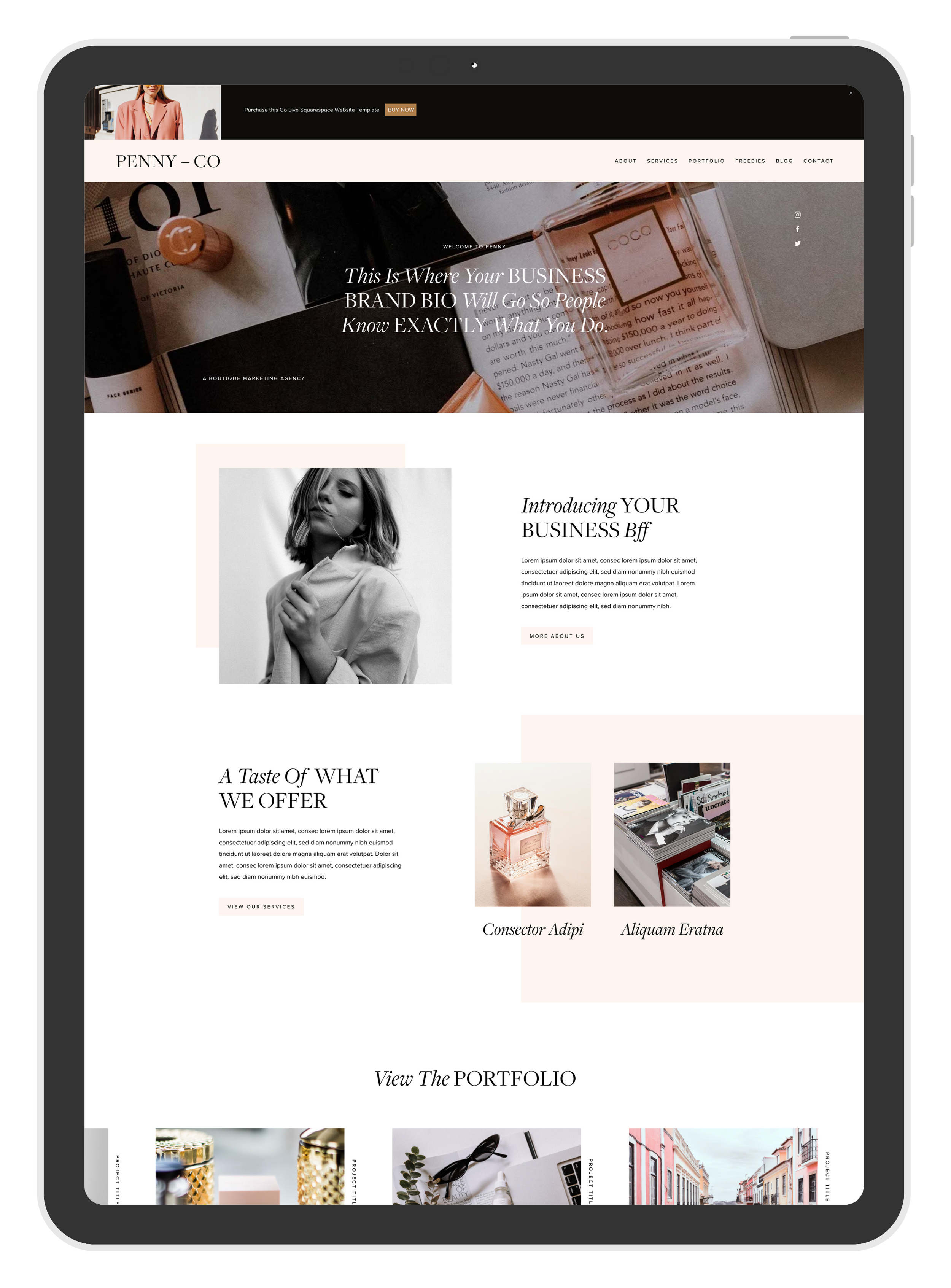
PENNY Squarespace template by GoLive available in the shop
👉 Pro Tip: Create a simple checklist of these points and revisit your site every few months to make sure it stays updated, secure, and optimized.
And if you’re ready to take the next step, you don’t have to start from scratch. Check out some of my favorite website templates below - they’re affordable, modern, and beginner-friendly.
Plus, if the idea of designing it all yourself feels overwhelming, the good news is that most of these template providers also offer template styling services at a fraction of the cost of a fully custom site. It’s the perfect middle ground between DIY and professional design.
Special discounts kindly provided by the providers. Between 10-15% off for you!
All links are affiliate links which helps me to keep creating content at no extra cost to you.

Hey, I’m Stine
I’m a photographer, designer and (scrappy) content creator creating resources to help creatives and small business owners build the business of your dreams and a life on your own terms.
Thanks for stopping by! Sx